Optimizing fleet management
B2B SaaS solution for efficient end-to-end fleet asset management powered by AI.
Checkturio Startup, Berlin, Germany

Problems
1. Unclear user flow in both web & mobile apps.
2. Deficiency and inconsistent in UI design
3. Complex functionality overload.
Deliverable
Detecting problems, identifying key metrics, and finding solutions for complex workflows.
User flows, Information architecture, storytelling & scenarios, interaction design, wireframing, design system, visual and user interface design, and project management.
Role & Duration
Sole UX/UI Designer (Mobile & Web apps)
Usability satisfaction
+48.9%
Increased customers
+18%
Challenges (selected)
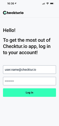
When I began my role at Checkturio, the initial product had been developed just 6 months prior, presenting numerous challenges. My primary objective entailed identifying these obstacles and initiating collaborative efforts with stakeholders to systematically tackle them. Through iterative processes, I focused on enhancing the usability of both the mobile and web applications.
1. Information architecture enhancement
2. UI & visual design improvement
3. User flows & usability enhancement
4. Workflow implementation
5. Optimizing Web dashboard
1. Information architecture enhancement
Define functions
I started by gathering insights from stakeholders in fleet management. Then, I organized these insights into clear menus and features for both apps, ensuring users can navigate smoothly.
What I gathered
Identifying key metrics
.png)
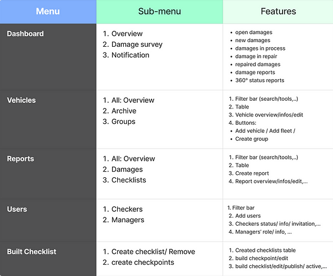
Information architucture
I organized the main page, sub-pages, and important functions in the web app based on how users move through it, ensuring a clear hierarchy for easy navigation.

Result:
Driving user engagement through app navigation enhancement.
Before
.png)
After

1. Seamlessly integrated new functions into main and sub-menus
2. Consolidated similar content into clear and cohesive categories
3. Standardized button text for consistent user experience
2. UI & visual design improvement
Design identity
I crafted a cohesive primary color scheme, drawing inspiration from the logo design, to ensure visual consistency across all products.
Colors style

Buttons style

I refined components and updated the design system with refreshed UI designs: (selected examples)

Custom visual labels
To address the challenge of multiple pages containing extensive data, I designed custom visual labels for main pages, specifically tailored to each page's content. These visual cues enhance user understanding and make navigation more intuitive, ultimately improving usability and user-friendliness.

Result:
Significantly enhanced user interface & interaction design
Before
.png)
After


.png)
3. User flow & usability enhancement
Problem identification
I identified common usage challenges by outlining typical scenarios and providing drivers' actions to achieve their goals efficiently.


Improving usability
1. Homepage revamp: Introduced new features like a search bar and filters, categorizing and displaying them to improve usability.
2. Enhanced navigation bar: Implemented a tab bar featuring "All" and "Saved" vehicles with a visible counter on the homepage for streamlined access.
Paper wireframing
Before

After

Grouping similar functionalities:
-
Filter
-
Search bar
-
License plate number scanning
Moved the "Saved" page to the tab bar for easier access and improved usability.
Organizing functions
1. Introduced a new "Create report" CTA button, clearly distinguished from other actions.
2. Restructured report types into unified radio buttons on a separate screen for clarity.
3. Organized and prioritized vehicle information within the vehicle overview section for easy reference.
Before

After


Result:
Optimizes user experience by smoother flow & enhanced usability platform-wide.

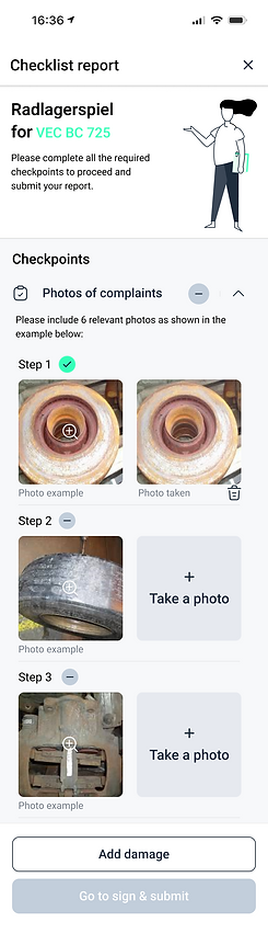
4. Workflows implementation
Customer's checklist
I created and designed a checklist flow featuring images displayed in a sequence, tailored to the customer's demands and the requested algorithms (Duration: 1 day)
Workflows
Design


Workflows on the web app
I created and designed workflows for desktop users, to create checklists, edit and publish them to the mobile app, or archive them. (Duration: 1 week)
Report creation flow through the web app
I designed intuitive workflows for desktop users to create damage reports step-by-step, ensuring ease of use and alignment with the product's identity. (Duration: 1 week)
Selected designs-flows


5. Optimising web dashboard
Identify key metrics
I listed all possible information that could be displayed and created a sublist of dimensions.

Critical thinking
-
how important is information
Grouped and generalized metrics into components, so we could address a lot of metrics within reusable components.
-
how actionable is information
Defined actions for those metrics, e.g. damages created in the last 7 days should lead to a table with damages filtered out.

Design and solutions

What I learned
1. Enhanced communication and collaboration: Strengthened teamwork by collaborating with developers, the product leader, the marketing team, and stakeholders.
2. Advanced user-centric design skills: boosting skills of storytelling & scenarios, designing complex workflows, interaction design, and end-to-end user experience.
3. Agile project management proficiency: Mastered agile methodologies for efficient project delivery and product management.
4. I am continuously learning and seeking growth opportunities......